
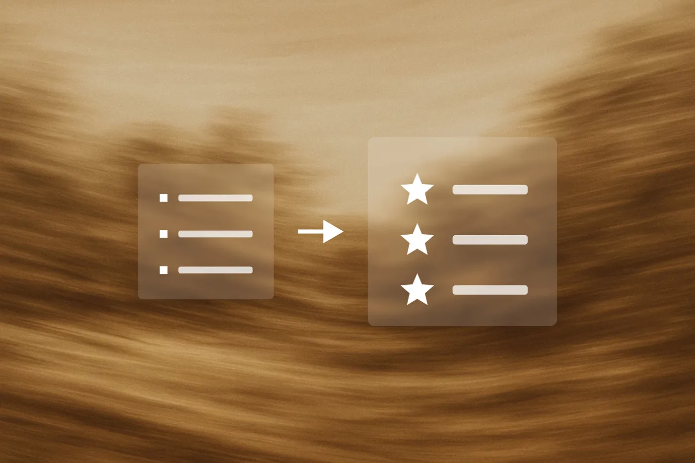
You know when you're building a pricing page and the default bullet points look boring? There's a simple CSS trick to replace them with custom SVG icons. Your clients can still add and remove list items normally through the rich text editor, but now they look way better.
I use this on basically every project where there are feature lists, pricing tiers, or any bulleted content that needs to look more polished. It's one of those small touches that makes a big difference. Here's an example of an implementation I've done:

The main advantage here is simplicity for your clients. They don't need to understand Webflow components or mess around in the Designer. They just use the regular rich text editor, add bulleted lists like normal, and the custom icons appear automatically.
Plus SVGs scale perfectly and load fast. You can match your brand colors, use custom shapes, whatever. Much better than boring dots.
<step>
<step-number>Step 1</step-number>
<step-header>Set Up Your Rich Text Element</step-header>
<step-content>
Add a Rich Text element where you want the custom bullets and give it a class name like pricing-features or custom-bullets. Add some sample bulleted content to test with.
Style the typography how you want it – font, size, color, spacing. The bullet styling comes later.
</step-content>
</step>
<step>
<step-number>Step 2</step-number>
<step-header>Get Your SVG Ready</step-header>
<step-content>You'll need your SVG as a data URI. What the hell is a data URI? It's basically a way to embed an image directly in your CSS instead of linking to a separate file. Since we're using the content property to insert our icon, we can't just reference a regular image file – it needs to be encoded as data.
Take your SVG code and run it through an online SVG to data URI converter. There are plenty of free ones. I used SVGViewer's tool.
Your SVG code goes from what it normally looks like, to something really weird like this:
data:image/svg+xml,%3Csvg fill='%23ff123c'%3E...%3C/svg%3E
The converter handles all the encoding for you – it's just replacing characters that would break CSS with safe alternatives.</step-content>
</step>
<step>
<step-number>Step 3</step-number>
<step-header>Position the List Items</step-header>
<step-content>
Add this CSS to your custom code (page settings or site settings):
.your-class-name ul li {
  position: relative;
  padding-left: 2rem;
}
Why position: relative? Because in the next step we're going to absolutely position our custom icon, and absolute positioning is relative to the nearest positioned parent. Without this, your icons would float off to weird places.
The padding-left creates space for your custom icon. Adjust that value based on how big you want your icons – usually somewhere between 1.5rem and 3rem works well.</step-content>
</step>
<step>
<step-number>Step 4</step-number>
<step-header>Add Your Custom Icon</step-header>
<step-content>
Now replace the default bullets with your SVG:
.your-class-name ul li::before {
  content: url("your-data-uri-here");
  position: absolute;
  left: 0;
  top: 0;
}
Replace "your-data-uri-here" with the data URI from step 2.
What's happening here? The ::before pseudo-element creates a virtual element before each list item that holds your custom icon. Think of it as injecting invisible HTML that only CSS can see. We position it absolutely so it sits exactly where we want it (at the left edge) instead of pushing the text around.
</step-content>
</step>
<step>
<step-number>Step 5</step-number>
<step-header>Size and Align Everything</step-header>
<step-content>Set explicit dimensions so your icons are consistent:
.your-class-name ul li::before {
  width: 1.5rem;
  height: 1.5rem;
}
Without setting width and height, your SVG might show up huge or tiny depending on how it was originally created. This forces it to be the size you actually want.
If the vertical alignment looks off, add:
transform: translateY(0.125rem);
Adjust that translateY value until it looks right. Sometimes you need different values depending on your font – this just nudges the icon up or down by tiny amounts.</step-content>
</step>
<step>
<step-number>Step 6</step-number>
<step-header>Hide the Default Bullets</step-header>
<step-content>Remove the original bullet points:
.your-class-name ul {
  list-style: none;
  padding-left: 0;
}
Why do this? Because right now you have both the default bullets AND your custom icons showing up. list-style: none gets rid of those default dots, and padding-left: 0 resets the list padding since you're already handling spacing with your custom padding from step 3.</step-content>
</step>
<step>
<step-number>Step 7</step-number>
<step-header>Test It Out</step-header>
<step-content>Add some list items through the rich text editor and see how it looks. Test with different content lengths – single words, long sentences that wrap to multiple lines.
Check it on mobile too. You might want smaller icons on smaller screens:
@media (max-width: 768px) {
  .your-class-name ul li::before {
    width: 1.25rem;
    height: 1.25rem;
  }
}
</step-content>
</step>
Here's what I used on a recent pricing page:
.pricing_feature-rich-text ul {
  list-style: none;
  padding-left: 0;
}

.pricing_feature-rich-text ul li {
  position: relative;
  padding-left: 2rem;
  margin-bottom: 0.75rem;
}

.pricing_feature-rich-text ul li::before {
  content: url("data:image/svg+xml,%3Csvg width='100%25' height='100%25' viewBox='0 0 32 32' fill='none' xmlns='http://www.w3.org/2000/svg'%3E%3Cpath d='M16 2C13.2311 2 10.5243 2.82109 8.22202 4.35943C5.91973 5.89777 4.12532 8.08427 3.06569 10.6424C2.00607 13.2006 1.72882 16.0155 2.26901 18.7313C2.80921 21.447 4.14258 23.9416 6.10051 25.8995C8.05845 27.8574 10.553 29.1908 13.2687 29.731C15.9845 30.2712 18.7994 29.9939 21.3576 28.9343C23.9157 27.8747 26.1022 26.0803 27.6406 23.778C29.1789 21.4757 30 18.7689 30 16C30 12.287 28.525 8.72601 25.8995 6.1005C23.274 3.475 19.713 2 16 2ZM14 21.59L9.00001 16.59L10.59 15L14 18.41L21.41 11L23.006 12.586L14 21.59Z' fill='%23ff123c'/%3E%3Cpath d='M14 21.591L9 16.591L10.591 15L14 18.409L21.41 11L23.005 12.585L14 21.591Z' fill='white'/%3E%3C/svg%3E");
  position: absolute;
  left: 0;
  top: 0;
  transform: translateY(0.125rem);
  width: 1.5rem;
  height: 1.5rem;
}
That creates a nice red checkmark icon for each feature, like in the image at the top of this post. Much better than default bullets.
If your icons aren't showing up, check that your class name matches and that you're using bulleted lists (not numbered lists) in the rich text editor.
If alignment looks weird, play with the transform: translateY() value. Different fonts need different adjustments.
On mobile, you might need smaller icons. Test on actual devices, not just browser dev tools.
Tell your clients to use the bulleted list option in the rich text toolbar. The custom icons will appear automatically. Keep it simple – they don't need to know about the CSS magic happening behind the scenes.
This technique works great for pricing pages, feature lists, process steps, or anywhere you want branded bullets instead of boring dots. Takes a few minutes to set up, but it's one of those details that makes everything look more professional.
Like What you read? You should subscribe to my newsletter for more.